Tutorial on Introduction to biostatistics
Data compilation
Once the data is collected and validated it can then be compiled. Tabulation is the basic method of compilation.
Data Analysis
Primary data analysis starts with the diagrammatic and graphical representation of the data. The following are frequently used methods:
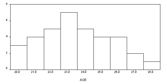
A. Histogram
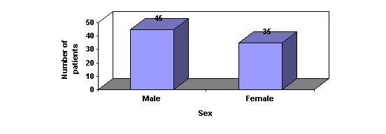
B .Bar Graph
C .Pie chart
D. Line graph
A. Histogram
Histograms consist of a series of blocks or bars, each with an area proportional to the frequency. In a histogram the horizontal scale is used for the variable and the vertical scale to show the frequency.
The highest block in a histogram indicates the most frequent values. The lowest blocks show the least frequent values. Where there are no blocks, there are no results that correspond to those values. Blocks of equal height indicate that the values they represent occur in the same frequency.
Age distribution of patients in a cancer study
B. Bar Graph
In a simple bar chart, each bar represents a different group of data. Although the bars may be drawn either vertically or horizontally, it is conventional to draw the bars vertically whenever possible. The height or length of the bar is drawn in proportion to the size of the group of data being represented. Unlike a histogram, the bars are drawn separated from one another.
Sex wise distribution of patients in a cancer study
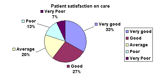
C. Pie Charts
Pie charts, or circle graphs as they are sometimes known, are very different from other types of graphs. They don't use a set of axes to plot points. Pie charts display percentages.
The circle of a pie graph represents 100%. Each portion that takes up space within the circle stands for a part of that 100%. In this way, it is possible to see how something is divided among different groups.
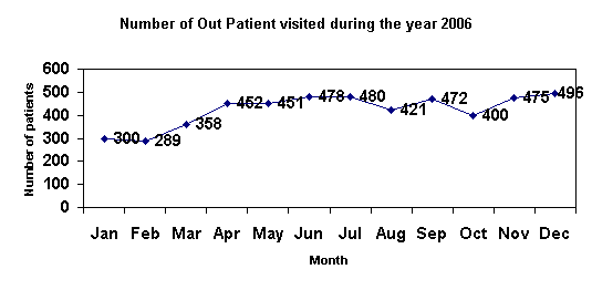
D. Line graph
A Line graph is drawn after plotting points on a graph that are then connected by a line. Line graphs are useful to display data trends.